5 Simple Tips For Designing A Great Trade Show Display

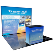
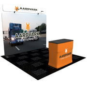
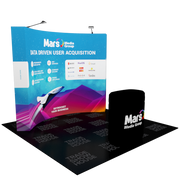
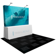
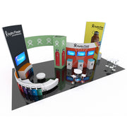
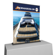
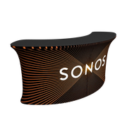
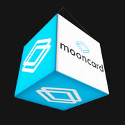
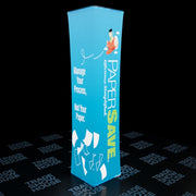
The main reason for going to a trade show is to build your network of professional connections and boost your customer base. For that to occur, you will need to draw visitors to your trade show booth area. This requires you to to create an eye-catching and unique design that will catch attendees attention while keeping the statement simple enough for them to comprehend what they are seeing. One of the most important attributes of designing your trade show display is making it visible from afar.
Here are 5 Simple Tips For Designing A Great Trade Show Display:
1. Your design must be high impact
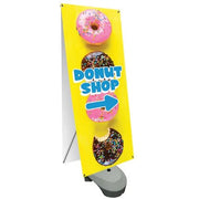
When deciding on the graphic design for a trade show booth, remember that most visitors are walking by quickly. They spend just a few seconds looking at any booth, and your graphics must accomplish two goals very quickly.
- They must give a very quick impression of the brand (product or service) with an image or bold statement.
- The graphic must disqualify any visitor who is not interested, so they don’t come into your booth.
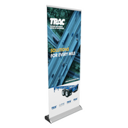
Imagine a billboard on a freeway. The goal of the billboard is to give an impression in a flash. If there are more than just a few words or a single image on a billboard, there is too much for a driver to absorb in the second she glances upward.
2. Less is more
Don't cram too much into your trade show booth design. If you overfill your design with too much information, nothing stands out. Rather than showcasing all of your technical details of your products or services, keep it simple and focus on a specific message you want to reach with your prospects. This saying has been around for a long time, and it still holds true to today.
3. Include lots of white space
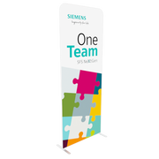
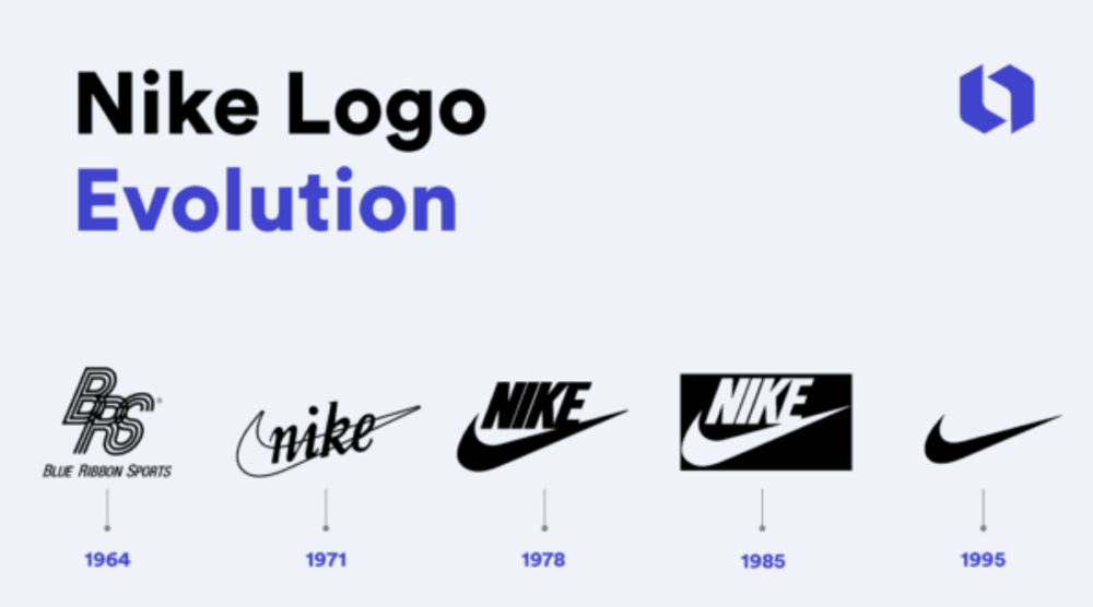
Allow images and words on your trade show display to breathe and not be cluttered tightly together. What's on your trade show display is important, but so is exactly what isn't. A properly designed trade show display should include uncluttered white space and margins allowing attendees to easily read and understand your message which will in turn make a bigger impact.

4. Choose easy-to-read fonts
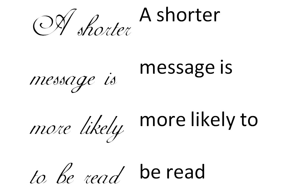
It's important to remember you want visitors to come to your booth, so it is important to make your graphic design easily readable from a distance. Using fonts that clearly readable helps tremendously. Many people believe that utilizing all capital words makes their signage more impactful, but a combination of upper and lowercase letters is in fact much easier to read, even from a distance. Save all caps for particular emphasis.
5. Keep the design consistent
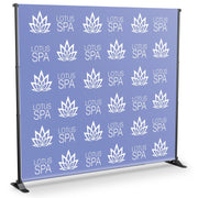
Your trade show display design should be consistent with your current brand image. Keeping the same theme between banners, posters, marketing material and business cards presents to the individual a sense of professionalism and gives polish to your overall presentation. Your trade show display will showcase a well-planned and properly structured idea which producing a lasting impression on them well after the show.
Choose The Right Partner
To truly make a memorable impression at your next event, it's essential to possess a trade show booth display that exudes quality, captures attention, and fosters engagement. With Trade Show House as your partner, crafting an impeccable trade show exhibit that resonates with your brand's aesthetics becomes an exciting reality. Our collaboration empowers you to customize the display to seamlessly align with your company's identity. Prior to finalizing, you'll have the opportunity to preview the exhibit, instilling you with confidence for your next trade show event!

