

10 Trade Show Booth Design Ideas To Help You Stand Out At Your Next Event

The overall goal of your trade show booth graphics is to attract the right attendees to your booth with a brief and bold statement. Especially for younger, lesser-known brands, it’s important to remember that using just your company name will not usually achieve that purpose. Attendees aren’t likely to play a guessing game as to what your brand is all about; they’ll just move on to the next booth. Here are some tips for being briefer, bolder, and more relevant than other exhibitors:
1. Use clear, eye-catching copy to qualify booth traffic.
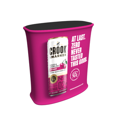
As a rule of thumb, try to create a 6-word tagline that a reader can interpret within 3 seconds. Keep it honest, and don’t make it too abstract. If you’re a young brand, your brand name can be secondary to the tagline, as it will ultimately be more effective in drawing people to your booth. By stating clearly what your brand is about, you’ll also find that the people entering your booth are attendees who are actually interested in your brand/products.
2. Choose one main thing attendees should remember.
What do you want attendees to remember after the show when they think of your booth? Your top pick may change from show to show. If you’re launching a new product or have a new way to solve a pain point, for instance, you will probably want to promote that fact.
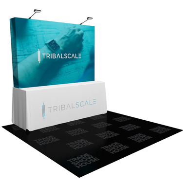
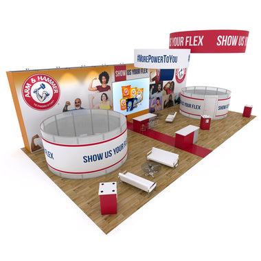
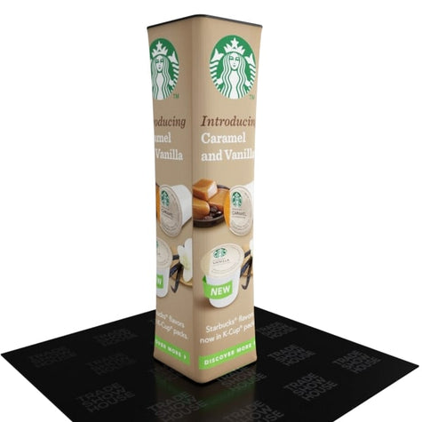
3. Display your choice on the back wall.
The back wall is the focal point of small- to mid-sized booths. Use it to convey the one thing you want the audience to remember about you. Larger booths may have an extra point of reference or even two back walls (if it is on the corner of a row), but it will always be a top piece of your booth’s graphical “real estate.” Use it wisely.
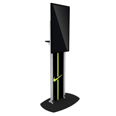
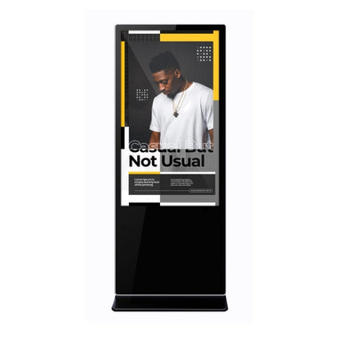
4. Use digital graphics for a big advantage, but keep the message clear.
Digital graphics shown on display screens are not yet as pervasive as traditional printed graphics. They can do a great job of attracting attention simply by showing changing images, like your logo or videos of your product in action. Variety and on-screen action are powerful tools, but try overwhelm people. Focus on sending one strong message.
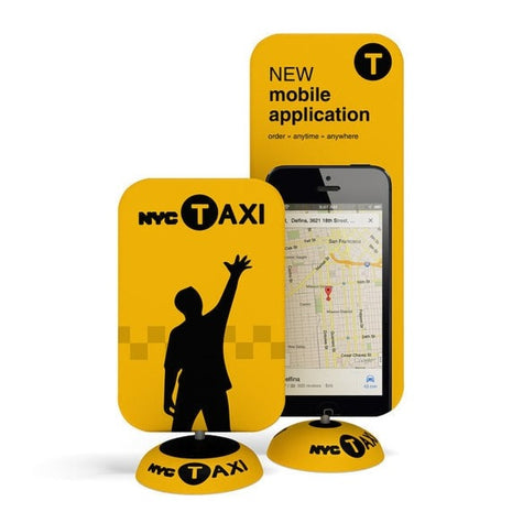
5. Integrate QR codes with print graphics.
You can give traditional print graphics a bit of an upgrade by including QR codes, which are barcode-style images visitors can scan with their smartphones. Scanning a code sends their smartphone’s web browser to a page on the internet like your website, an online product description, an interactive experience, or Youtube video. Make sure that the “experience” they are led to after scanning the QR code is high-impact.
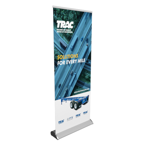
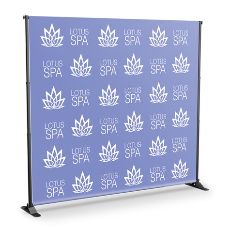
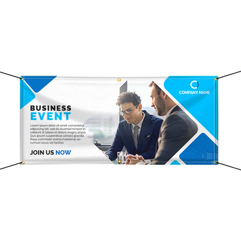
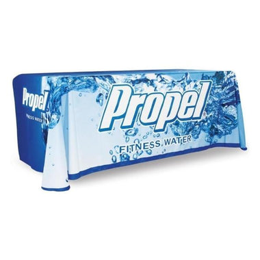
6. Use a limited number of static images.
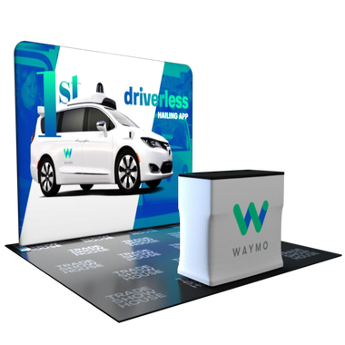
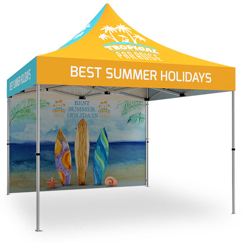
Apart from your corporate logo, try to avoid using too many static images (e.g. photographs) around the booth. Think about how graphics are done on billboards. It is necessary to use images that “hit hard” in just a second or two because that’s all that people have to glance at them. There’s a time and a place for collections of images (e.g. your product catalog) but your booth graphic design is not one of them. You may also decide not to use any images at all.
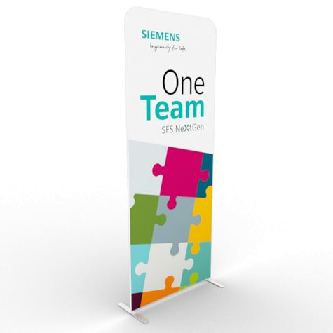
7. Use a limited number of bright colors.
The rule of thumb is to use an absolute maximum of three colors. Again, the focus is on getting a simple message across in the least amount of time. Using a lot of different colors can make the booth feel “busy” and confuse the main message.
8. Respect empty space.
The overall rule of thumb for booth design graphics is that they should be 40% empty space. That’s right––almost half of your graphics space should be totally blank. That is because what your message does not say is just as important as what it does say. Remember, you only get one shot at being memorable. Don’t clutter your booth with extraneous information.
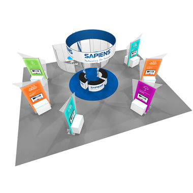
9. Use your graphics’ height to attract visitors from all over the trade show.
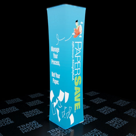
You may need to have three main types of graphics, depending on how far away attendees can stand from your booth: long-range, medium-range, and short-range. You should place long-range graphics as high as possible within trade show regulation limits. Medium-range graphics go above eye level, around 6 – 8 feet above the floor, while short-range would be 5 – 6 feet above the floor.
10. Make your text legible.
Sans-serif fonts like Helvetica are generally considered to be the most easily read. Of course, your brand’s style guide will dictate some of these font decisions, but remember not to use more than 2 or 3 different fonts at the same time. As for size, a good rule of thumb is to add an inch of height to the font for every foot away that viewers will stand. If you want visitors to read your text comfortably from 10 feet away, for example, add 10 inches to the font size.
To conclude, it’s important to remember that a well-trained, highly motivated booth staff can handle just about any trade show mishap, including a poorly designed booth. If you absolutely must make difficult budgeting decisions, prioritize investing in people. Just remember that the real magic happens when the right people are given the right resources. A good booth is definitely the right resource for any team.
-
Posted in
booth traffic, graphic design, trade show, trade show booth design, trade show booth ideas, trade show display, trade show tips